This judgment was handed down remotely at 10.30am on 11 March 2025 by circulation to the parties or their representatives by e-mail and by release to the National Archives.
.............................
HIS HONOUR JUDGE HACON
Judge Hacon :
Introduction
1. This is an application for summary judgment. The claim is for infringement of UK registered trade mark no. 907527963 (‘the Trade Mark’) owned by the claimant (‘Babek’). There is a counterclaim by the defendant (‘Iceland’) for a declaration that the Trade Mark is invalid and an additional claim brought by Iceland against the son of a former proprietor of the Trade Mark.
2. Summary judgment is sought by Iceland on its counterclaim for a declaration of invalidity.
3. Sam Carter appeared for Iceland, Jennifer Dixon for Babek. They provided thorough and very helpful written and oral submissions.
The claim
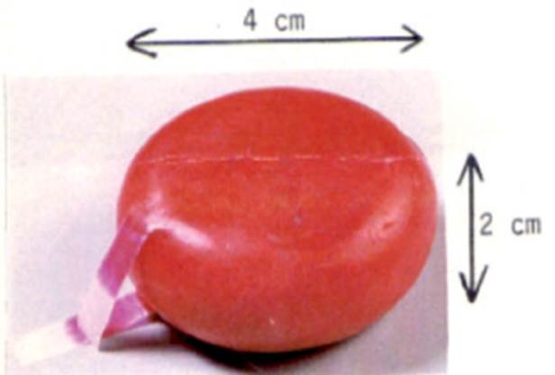
4. The Trade Mark is which was derived from an EU trade mark following Brexit. The parent EU trade mark was revoked for non-use from 4 April 2022. The Trade Mark takes the form of this device:
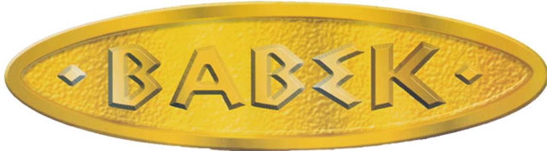
5. Babek is kebab spelt backwards. The Trade Mark is registered for goods and services including specified foods and drinks in class 29.
6. This is the description in the registration of the Trade Mark on the file of the UK Intellectual Property Office (UKIPO):
‘Gold oval with embossed BABEK writing. Colour Claimed: Gold, black.’
7. Iceland is the owner of the well-known supermarket chain. It is common ground that Iceland sold goods bearing a sign identical to the Trade Mark and that they were goods in respect of which the Trade Mark is registered. The defence to infringement is that the sales were made with the consent of a former proprietor of the Trade Mark or under the licence of a third party who had authorisation to license the Trade Mark.
Grounds of alleged invalidity
8. Iceland alleges that the registration of the Trade Mark was not in conformity with ss.1(1) and 3(1) of the Trade Marks Act 1994 (‘the 1994 Act’) and should be declared invalid pursuant to s.47(1). These are the relevant provisions of the 1994 Act:
‘1. Trade marks.
(1) In this Act “trade mark” means any sign which is capable—
(a) of being represented in the register in a manner which enables the registrar and other competent authorities and the public to determine the clear and precise subject matter of the protection afforded to the proprietor, and
(b) of distinguishing goods or services of one undertaking from those of other undertakings.
A trade mark may, in particular, consist of words (including personal names), designs, letters, numerals, colours, sounds or the shape of goods or their packaging.
3. Absolute grounds for refusal of registration.
(1) The following shall not be registered—
(a) signs which do not satisfy the requirements of section 1(1);
…
47. Grounds for invalidity of registration.
(1) The registration of a trade mark may be declared invalid on the ground that the trade mark was registered in breach of section 3 or any of the provisions referred to in that section (absolute grounds for refusal of registration).’
9. The parties are agreed that the validity of the Trade Mark can and should be determined at this application and that no evidence is required.
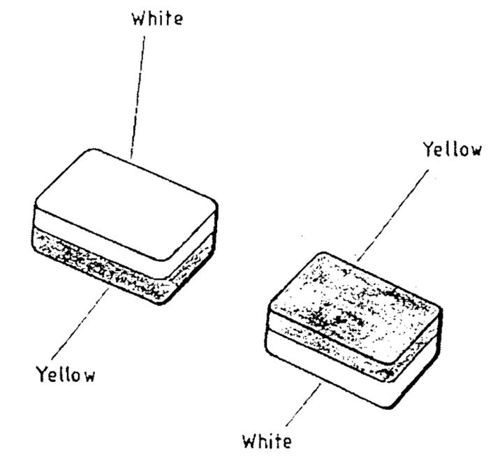
The case law
10. I was taken to a line of authorities relevant to the correct application of s.1(1). An important step in explaining what the requirements of s.1(1) entail - more exactly the equivalent provisions in the EU Directive from which the subsection is derived - came in the judgment of the CJEU in Sieckmann v Deutsches Patent- und Markenamt (C-273/00) EU:C:2002:748. This the first paragraph of the dispositive ruling (my underlining):
‘1. Article 2 of Council Directive 89/104/EEC of 21 December 1988 to approximate the laws of the member states relating to trade marks must be interpreted as meaning that a trade mark may consist of a sign which is not in itself capable of being perceived visually, provided that it can be represented graphically, particularly by means of images, lines or characters, and that the representation is clear, precise, self-contained, easily accessible, intelligible, durable and objective.’
11. Sieckmann was about an olfactory mark, raising issues all of its own, but the ruling applied generally and the words underlined are treated as stating the requirements of all trade marks. They have since become enshrined in art.3(1) of EU Trade Mark Implementing Regulation 2018/626.
12. The CJEU explained the Sieckmann criteria further in Chartered Institute of Patent Attorneys v Registrar of Trade Marks (IP Translator) (C-307/10) EU:C:2012:361:
‘[46] In that connection, it must be recalled that the entry of the mark in a public register has the aim of making it accessible to the competent authorities and to the public, particularly to economic operators (Sieckmann, at [49], and Case C-49/02, Heidelberger Bauchemie GmbH's Trade Mark Application [2004] E.C.R. I-6129, at [28]).
[47] On the one hand, the competent authorities must know with clarity and precision the nature of the signs of which a mark consists in order to be able to fulfil their obligations in relation to the prior examination of applications for registration and the publication and maintenance of an appropriate and precise register of trade marks (see, by analogy, Sieckmann, at [50], and Heidelberger Bauchemie, at [29]).
[48] On the other hand, economic operators must be able to acquaint themselves, with clarity and precision, with registrations or applications for registration made by their actual or potential competitors, and thus to obtain relevant information about the rights of third parties (Sieckmann, at [51], and Heidelberger Bauchemie, at [30]).’
Colour per se marks
13. The Sieckmann criteria have been considered several times by the CJEU in relation to colour per se marks, that is to say trade marks which consist exclusively of one or more colours, see in particular Libertel Groep BV v Benelux-Merkenbureau (C-104/01) EU:C:2003:244 and Heidelberger Bauchemie GmbH’s Trade Mark Application (C-49/02) EU:C:2004:384.
14. An early English judgment on colour per se marks was that of the Court of Appeal in Société des Produits Nestlé SA v Cadbury UK Ltd [2013] EWCA Civ 1174. The visual representation of the trade mark applied for consisted of a rectangular purple block. The verbal description was:
‘The colour purple (Pantone 2685C), as shown on the form of the application, applied to the whole visible surface, or being the predominant colour applied to the whole visible surface, of the packaging of the goods.
15. The Court of Appeal considered Sieckmann, Libertel, Heidelberger Bauchemie and Dyson Ltd v Registrar of Trade Marks (C-321/03) EU:C:2007:51 (not a colour per se case). Sir John Mummery set out principles to be derived from those cases by reference to the article of the EU Directive from which s.1(1) of the 1994 Act is derived:
‘15. Some general points relating to the requirements of art.2 of the directive, which are relevant to this case, can be picked out of the judgments:
The conditions
(1) An application to register a trade mark must satisfy three conditions for the purposes of Article 2 :
(i) there must be a sign;
(ii) it must be capable of graphical representation;
(iii) it must be capable of distinguishing the goods or services of one undertaking from those of other undertakings.
Purpose
(2) The purpose of the requirements is to prevent abuse of trade mark law in order to obtain an unfair competitive advantage.
Identification
(3) Identification requirements for entry of a trade mark on the public register of trade marks include clarity, intelligibility, specificity, precision, accessibility, uniformity, self-containment and objectivity.
Multitude of forms
(4) The identification requirements are not satisfied, if the mark could take on a multitude of different appearances, which would create problems for registration of the mark and give an unfair competitive advantage over competitors.
Colour without a message
(5) Colours are normally a simple property of things, or a means of decorating things. They are not normally capable of being a sign. A sign conveys a message. The sign is capable of being registered as a trade mark, if the message is about the source of goods or services.
Colour as a sign conveying a message
(6) Depending on the facts and circumstances of the case, colours, or combinations of colours, designated in the abstract and without contours and used in relation to a product or service are capable of being ‘a sign’.
Graphic representation of colour
(7) As for the second condition of graphical representation, in a mark consisting of two or more colours designated in the abstract and without contours, qualities of precision and uniformity are required. The colours must be arranged by associating them in a predetermined and uniform way.
Colour without form/in a multitude of forms
(8) Those requirements are not met by the mere juxtaposition of colours without shape or contours, or by reference to colours in every conceivable form, so that the consumer would not be able to recall or repeat with certainty the experience of a purchase. The scope of protection afforded by such a mark would be unknown both to the competent authorities responsible for maintaining the register and to economic competitors. Registration would confer unfair competitive advantages on the proprietor of the mark.’
16. Sir John, with whom Lewison LJ and Sir Timothy Lloyd agreed, took the view that the use of the word ‘predominant’ in the description of the mark applied for meant that a predominant part of the mark had to be purple, but the rest could be anything. The range of possibilities this opened up led to the consequence that the mark was neither a sign nor capable of being graphically represented.
17. In Glaxo Wellcome UK Ltd v Sandoz Ltd [2017] EWCA Civ 335 the certificate of registration of the EU mark in suit designated the mark with the INID code number 558. (INID is the acronym for “Internationally agreed Numbers for the Identification of (bibliographic) Data”) INID code 558 identified the mark in suit as being a colour per se mark. The visual representation was a photographic image of an inhaler in two shades of purple:
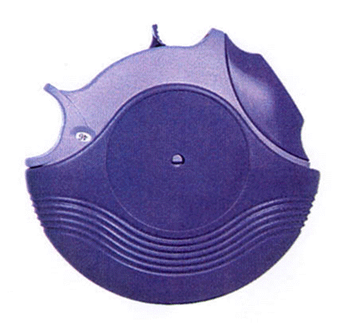
18. The written description was:
‘The trade mark consists of the colour dark purple (Pantone code 2587C) applied to a significant proportion of an inhaler, and the colour light purple (Pantone code 2567C) applied to the remainder of the inhaler.’
19. The Court of Appeal held that the issue for the public, including economic operators, inspecting the register was how the trade mark was to be understood. This presented the public with a puzzle which had three possible solutions, only one of which, rejected by the court, led to a mark having a single form. The mark would not be perceived unambiguously and uniformly by the public. Accordingly, the trade mark lacked the clarity, intelligibility, precision, specificity and accessibility that the law demanded. It also offended against the principle of fairness because the uncertainty as to what the subject matter of the mark actually was gave the proprietor an unfair competitive advantage. These deficiencies were compounded by the range of alternatives that the possible interpretations of the registration encompassed.
20. Kitchin LJ, with whom Sir Geoffrey Vos C and Floyd LJJ agreed, endorsed the principles set out by Sir John Mummery in Nestlé. He emphasised the importance of the registration or application conveying a clear and precise definition of the mark to the public and the authorities, explaining why that is.
‘[34] … It seems to me, however, that two further points emerge from the decisions of the CJEU to which I have referred which also have a bearing on the issues before us. The first concerns the constituent elements of the graphic representation of a sign consisting of one or more colours per se and for which a registration is sought. The INID code of course tells the authorities and the public the nature of the mark. That aside, it is, I believe, clear from Libertel [2004] F.S.R. 4 at [30]–[38] and [68] that, in the case of an application to register a single colour per se as a trade mark, the filing of a sample of the colour alone does not, of itself, constitute a graphic representation within the meaning of art.4 of the EUTMR. The filing of a sample of the colour together with a verbal description of the colour may, however, do so, provided the description is clear, precise, self-contained, easily accessible, intelligible and objective. Similarly and as the CJEU explained in Heidelberger [2004] E.T.M.R. 99 at [32]–[36] and [42], in the case of an application to register two colours per se as a trade mark, samples of the two colours together with a verbal description of those colours may constitute a graphic representation provided that the application for registration includes a systematic arrangement associating the colours in a predetermined and uniform way. The graphic representation therefore encompasses both the visual representation and any verbal description.
[35] Secondly, the function of the graphic representation is, in particular, to define the sign so that the subject matter for which protection is sought or has been secured can be clearly and precisely identified by the competent authorities and the public. Moreover and importantly, in order to fulfil its role as a trade mark and meet the requirements of precision and clarity, the sign must always be perceived unambiguously and uniformly. In my judgment it follows that if the authorities and the public are left in a state of confusion as to the nature of the sign then these requirements will not be satisfied.
[36] The reasons for these requirements are plain to see. A mark must always be perceived unambiguously if it is to fulfil its function as an indication of origin. Moreover, the authorities must refuse to register the sign if, upon opposition by the proprietor of an earlier trade mark, the sign is found to be identical to the earlier mark and if the products or services for which registration is sought are identical with those for which the earlier mark is protected. So also, upon opposition by the proprietor of an earlier trade mark, the authorities must refuse to register the sign where, by virtue of its identity or similarly with an earlier mark and the identity or similarity of the relevant goods or services, there exists a likelihood of confusion. Similarly, the owner of a registered trade mark is entitled to prevent a third party from using a sign which is identical to his mark for goods or services which are identical to those for which the mark is protected. He can also prohibit the use of a sign where, by virtue of its identity or similarity with the mark and the identity or similarity of the relevant goods or services, there exists a likelihood of confusion. As Advocate General Philippe Leger explained in his opinion in Heidelberger at [56], assessment of notions of “identity” and “risk of confusion” necessarily implies a precise knowledge of the sign and mark in question, as they are or as they may be seen by the public concerned.’
21. The INID code informed the public and the authorities of the nature of the mark. Thereafter neither the visual representation nor the written description in a trade mark registration (or application) took precedence in determining the nature of the mark. They had to be considered together:
‘[64] … I do not detect in the guidance given by the CJEU any suggestion that, in the case of applications to register marks consisting of one or more colours per se. the pictorial representation is paramount and the verbal description is secondary. To the contrary, the Court has focused on the graphical representation as a whole and emphasised that its function is to define the mark in the public register in such a way as to make it accessible to the authorities and to the public and to ensure that its scope is clear and precise.’
22. Kitchen LJ then considered the rules governing the representation of a trade mark in an application for an EU mark. At the relevant time they were contained in Commission Regulation (EC) 2868/95 as amended by Regulation (EU) 2015/2424 (as so amended, ‘the Implementing Regulation’). Rule 1(1)(d) stated that an application for an EU trade mark must contain a representation of the mark in accordance with Rule 3. These were the relevant parts of Rule 3:
‘(1) If the applicant does not wish to claim any special graphic feature or colour, the mark shall be reproduced in normal script as for example, by typing the letters, numerals and signs in the application …
‘(2) In cases other than those referred to in paragraph 1 and save where the application is filed by electronic means, the mark shall be reproduced on a sheet of paper separate from the sheet on which the text of the application appears. … Where it is not obvious, the correct position of the mark shall be indicated by adding the word “top” to each reproduction ….’
(3) In cases to which paragraph 2 applies, the application shall contain an indication to that effect. The application may contain a description of the mark.
…
(5) Where registration in colour is applied for, the representation of the mark under paragraph 2 shall consist of the colour reproduction of the mark. The colours making up the mark shall also be indicated in words and a reference to a recognized colour code may be added.’
23. Kitchen LJ said:
‘[65] … As Mr Howe points out, Rule 3(2) applies to all marks to which Rule 3(1) does not apply. In other words, it applies to figurative marks, colour per se marks and other special categories of marks such as three dimensional marks. In accordance with Rule 3(3), the applicant must, in cases to which Rule 3(2) applies, give an indication to that effect. This paragraph also says that the application may also contain a description of the mark. This permissive language caters for those applications, for example for the registration of some figurative marks, which do not require any description to render them clear and precise. However, it seems to me quite impossible to infer from its terms that the guidance given by the CJEU as to what is needed to satisfy the requirements of art.4 of the EUTMR in the case of an application to register as a trade mark one or more colours per se should be in any way qualified. Indeed, Rule 3(5) says that where the registration of any mark in colour is applied for, the representation of the mark must consist of a colour reproduction of the mark and the colours making up the mark must also be indicated in words. Moreover and importantly, Rule 3(2) says nothing about precedence between the pictorial representation and the verbal description where both have been provided.’
24. Kitchen LJ returned to the appropriate starting point in the interpretation of the mark:
‘[75] … The judge held, correctly in my view, that the designation of the Trade Mark with INID code 558 means that it is and would be understood to be a mark which consists exclusively of one or more colours. It is, in short, a colour per se mark. It is not a two-dimensional figurative mark having the appearance of the pictorial representation; nor is it a three-dimensional mark having a particular shape and coloured in a particular way. Further, anyone inspecting the register would understand that, as a colour per se mark, registered in respect of inhalers, it is at least implied that it is not limited to the colours as applied to the particular shape of inhaler depicted in the registration.
[76] Against this background, the issue for the public, including economic operators, inspecting the register is how the Trade Mark is to be understood.’
25. In Oy Hartwall AB v Patentti-Ja Rekisterihallitus (Case C-578/17) EU:C:2019:261 an application was made for a mark with the description ‘The colours of the sign are blue (PMS 278, PMC CYAN) and grey (PMS 877)’. Registration was sought in class 32 in respect of mineral waters. The applicant indicated that the application was for a colour mark, not a figurative mark. This was the visual representation:
26. The CJEU said:
‘[39] The verbal description of the sign serves to clarify the subject matter and scope of the protection sought under trade mark law (see, to that effect, judgment of 27 November 2003, Shield Mark BV v Kist (t/a Memex) (C-283/01) EU:C:2003:641 at [59], and, as an example, judgment of 24 June 2004, Heidelberger Bauchemie EU:C:2004:384 at [34]).
[40] As the Advocate General set out, in essence, in points AG60–AG63 of his Opinion, when the trade mark application contains an inconsistency between the sign, protection in respect of which is sought in the form of a drawing, and the classification given to the mark by the applicant, the consequence of which is that it is impossible to determine exactly the subject matter and scope of the protection sought under trade mark law, the competent authority must refuse registration of the mark on account of the lack of clarity and precision of the trade mark application.
[41] In the present case, the sign protection in respect of which is sought is represented by a figurative drawing, whereas the verbal description relates to a protection concerning two colours alone, that is, blue and grey. Moreover, Hartwall has clarified that it seeks to register the mark at issue as a colour mark.
[42] Those circumstances appear to reveal an inconsistency showing that the application for protection under trade mark law is unclear and imprecise.’
27. Thus, largely like the Court of Appeal in Glaxo, the CJEU focussed on clarity and precision.
Figurative and three-dimensional marks featuring colour
28. Robert McBride Ltd’s Trade Mark Application [2003] RPC 19 concerned an application for a mark to be registered for cleaning tablets. The proposed mark was graphically represented like this:
29. The application stated that the above signs were put forward for registration as three-dimensional marks with a claim to the colours yellow and white as indicated. The registrar rejected the application on the ground that the word ‘yellow’ was insufficiently precise. The Appointed Person upheld the objection, finding that the lack of specificity as to hue left the representation lacking the required degree of precision.
30. The issue in Calor Gas (Northern Ireland) Ltd’s Trade Mark Application SRIS O-340-16 (unrep.) was similar. The applicant had applied to register a series of two signs which were graphically represented in the form of a gas cylinder of the type used to fuel portable gas heaters. The representation was in monochrome and the description was as follows:
‘The Trade Mark consists of the colour yellow applied to the outer surface of the cylinder within which gas is contained.’
31. The Appointed Person found that the Sieckmann criteria had not been satisfied because of a lack of precision as to colour.
32. The trade mark in suit in J. Sainsbury plc v Fromageries Bel SA [2019] EWHC 34354 (Ch) was registered in class 29 for cheese. It was stated to be a three-dimensional mark and had the following description:
‘The mark is limited to the colour red. The mark consists of a three-dimensional shape and is limited to the dimensions shown above.’
33. This was the visual representation:
34. The conclusion reached was that the mark could be capable of distinguishing the cheese of the proprietor from that of another trader only if the particular hue of red used on the main body of the product was associated with the proprietor’s cheese:
‘[63] Turning to marks containing colour which are not colour per se marks, it is of course the entire mark, including non-colour elements, which must be capable of distinguishing. However, the colour element may play a part in ensuring that it is and that in turn may depend on the colour being of a particular hue.
…
[67] It seems to me that where a mark contains colour but is not a colour per se mark, the need for precision as to hue will depend on the extent to which other elements of the mark serve to make the mark capable of distinguishing. More exactly, it will depend on the extent to which the colour of the relevant feature of the mark contributes to making the mark capable of distinguishing and whether it is likely that only a particular hue will confer on the mark that capacity to distinguish. It will always be a question of fact and degree.’
Position marks
35. A position mark is defined in EU Trade Mark Implementing Regulation 2018/626 as ‘a trade mark consisting of the specific way in which the mark is placed or affixed in the goods’, see art.3(3)(d).
36. In Thom Browne Inc v Adidas AG [2024] EWHC 2990 (Ch) the claimants sought to invalidate a portfolio of 16 position marks owned by the defendant, all in the form of three stripes. Joanna Smith J held that 8 of the marks were invalid and some others were partially invalid being given a revised specification.
37. The judge identified one of the issues which arose in the case (the claimants are identified as ‘TB’ and the defendants as ‘adidas’):
‘[124] An important dispute between the parties at trial was the extent to which Sir John Mummery’s fourth point (Nestlé at [15(4)] dealing with ‘multitude of forms’) permits variations in the manifestations of the Mark. TB submits that a mark which consists of a multiplicity of signs is invalid and that variations within the sign can be permitted only if they are such as to “go unnoticed by a consumer” untainted by evidence of use or distinctive character. adidas submits, on the other hand, that [15(4)] of Nestlé cannot be understood to mean that a graphical representation which admits of any degree of variation is necessarily impermissible.’
38. The judge reached the following conclusion:
‘[134] In light of the above analysis, it appears to me that in considering whether variations inherent in a trade mark are impermissible (and consistent with the principles articulated in Nestlé and in Glaxo), the court must consider:
a. whether the variations affect the ability of the mark to convey clear and precise information to the registrar, to economic competitors and to the relevant public, or in some other way cause the mark to fall foul of the identification requirements (which remain the overarching requirements);
and
b. whether the mark is capable of denoting origin to the relevant public so as to enable a consumer to repeat the experience of a purchase. This consideration (which appears to me to preclude variations which alter the subject matter of the registration in the eyes of the public or, put another way is concerned with the importance of the sign being perceived unambiguously if it is to fulfil its function as an indication of origin - see Glaxo at [36]) is probably best regarded as part of the assessment as to compliance with the identification requirements. Certainly I agree with TB that it is not a self-contained test for registrability and nor is it intended as a proxy for a test of acquired distinctiveness. Nonetheless, its relevance was identified in Heidelberger and acknowledged in Nestlé at [15(8)].
[135] Thus I consider that the mere fact that a mark includes a number of possible variations or permutations will not inevitably render it invalid. It may very well do so, but it is clear from the authorities to which I have referred that the issue must be determined having regard to the considerations set forth above and the specific facts of the case. The degree of precision required in any case (and thus the extent of the permissible variations) will depend on the nature of the mark itself. It is clear from the authorities to which I have referred that colour marks give rise to very specific and particular issues which may not arise in relation to other types of marks.
[136] Support for this conclusion may be found in Kerly’s Law of Trade Marks and Trade Names (seventeenth edition) which points out at 2-066 that a word mark, which is represented by the word in capitals in plain type, will cover the word in a wide range of typefaces because the representation is clear and precise (see also Sony Ericsson O-138-06 per Richard Arnold QC (as he then was) sitting as an Appointed Person at [23], where the judge also recognised the potential for a mark represented in monochrome with no colour claim or limit to “embrace reproductions of that device in a variety of colours”).’
The relevance of categorisation
39. There is a passage in Thom Browne on which Iceland placed particular reliance in the present case. It comes in the section of the judgment where the judge listed matters she understood to be common ground:
‘e. the wording in many of the adidas Marks to the effect that they are “[t]hree dimensional” marks adds nothing, but is a peculiar feature of the fact that there is no opportunity on the registration form for the proprietor of a mark to register it as a “position mark”. As the General Court observed in Case T-68/16 Deichmann v EUIPO at [12]: “The decisive factor for the scope of protection of the mark is not the categorisation of the sign in question as a figurative, three-dimensional or position sign, but the way in which the mark will be perceived by the relevant public in relation to the goods concerned”. In other words, there is ultimately no magic in the description of the mark;’
40. Iceland submitted that this was a statement of law from which it follows that identification of a trade mark in a registration as three-dimensional, figurative, or anything else carries no weight. The categorisation of a mark depends on how the public will perceive it in use.
41. This common position of the parties in Thom Browne is not easy to reconcile with the judgment of the Court of Appeal in Glaxo, see paragraphs [34] and [75] quoted and discussed above.
42. Deichmann SE v EUIPO (T-68/16) EU:T:2018:7 is a judgment of the General Court. It concerned an appeal from the Fourth Board of Appeal of the EUIPO which had rejected an application for revocation of the mark in suit on the ground of non-use. It seems that there was no verbal description. This was the visual representation of the mark:
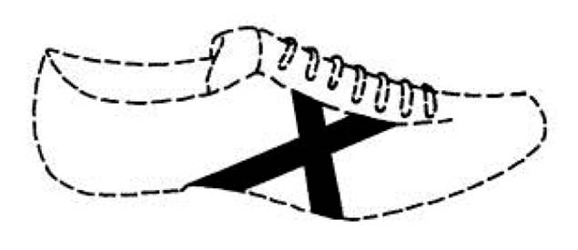
43. It was a position mark. However, when the mark was applied for, neither the Implementing Regulation in force at the time, nor the application form, nor the subsequent certificate of registration, recognised position marks as a distinctive category of mark. The mark was applied for and registered as a figurative mark.
44. Paragraph [12] of the judgment was in the section in which the General Court recited the decision of the Board of Appeal. There had been debate about whether, correctly interpreted, the mark was a figurative or a three-dimensional mark. The Board had said:
‘…this graphic representation which defin[ed] the mark, …whether the mark [was] a position mark or a figurative mark [was] irrelevant.’
45. The General Court then paraphrased what the Board had gone on to say:
‘The decisive factor for the scope of protection of the mark is not the categorisation of the sign in question as a figurative, three-dimensional or position sign but the way in which the mark will be perceived by the relevant public in relation to the goods concerned.’
46. The General Court agreed with the Board that it did not matter whether the mark was a position or a figurative mark. The case law recognised that position marks could be figurative marks. As to defining the protection sought:
‘[40] … it is sufficient to note that, in the present case, it may be inferred directly from the graphic representation of the mark at issue, and with sufficient precision, that the protection sought covered only a cross, consisting of two black intersecting lines, represented in solid lines.’
47. The Court did not specifically endorse the paraphrased section of the Board’s decision quoted in paragraph 45 above or state any rule of law that invariably the scope of protection of a mark must only, or even primarily, be determined by the way in which the relevant public would perceive the mark.
48. The decision of the Board of Appeal that the mark should not be revoked for non-use was upheld by the General Court.
49. The judgment of the General Court was appealed to CJEU: Deichmann v EUIPO (C223/18 P) EU:C:2019:471. The reasoning of the General Court was approved and the appeal dismissed:
‘[40] As regards the substance of the ground of appeal, it should be stated, first of all, that on the relevant date in this case, the applicable law did not define “position marks”, so that the General Court was not required to find that the classification of the mark at issue as a figurative mark or a position mark was relevant.
…
[42] The General Court correctly recalled, in paragraph 33 of the judgment under appeal, that “position marks” are similar to the categories of figurative and three-dimensional marks as they related to the application of three-dimensional elements to the surface of a product and that when assessing the distinctiveness of a mark, the classification of a “position mark” as a figurative or three-dimensional mark or as a specific category of marks, is irrelevant (judgment of 15 June 2010, X Technology Swiss v OHIM (Orange colouring of the toe of a sock), T‑547/08, EU:T:2010:235).
[43] Such a classification is also irrelevant in assessing, as in the present case, the genuine use of such a mark.’
50. Although in Glaxo the Court of Appeal’s analysis took the categorisation of the mark as a colour per se mark to be a firm starting point, I do not believe that the Court of Appeal intended to formulate any rule of law about this. And the judgment of the CJEU in Hartwell implies that there is no such rule of law. However, often it will be the most useful starting point. Its advantage is that the categorisation chosen is an unambiguous statement about the protection sought for the mark, whereas the visual representation and verbal description, individually and/or taken together, may not be - as in Glaxo.
51. Deichmann was unusual in that the categorisation which the proprietor intended was not available at the time of application, so the box ‘figurative mark’ was ticked faute de mieux. In those circumstances it could not be taken to be an unambiguous statement of the protection sought. There was no verbal description to qualify the visual representation, so the visual representation was the best guide to the protection sought.
The statutory requirements
52. Before considering the Trade Mark in this case, it is useful to return to the statute. The requirements of a trade mark set out in s.1(1) of the 1994 Act are that it is a sign which is capable:
(a) of being represented in the register in a manner which enables the registrar and other competent authorities and the public to determine the clear and precise subject matter of the protection afforded to the proprietor, and
(b) of distinguishing goods or services of one undertaking from those of other undertakings.
53. In Libertel the CJEU (at [23]) split these into three conditions: (i) that the putative trade mark is a sign, (ii) that it is capable of graphic representation and (iii) that it is capable of distinguishing. I take them in turn.
A sign
54. In Heidelberger Bauchemie the CJEU said that the purpose of the requirement that matter which an applicant seeks to register represents a sign is to prevent the abuse of trade mark law in order to obtain an unfair competitive advantage (at [24]).
Capable of graphic representation - capable of being represented in the register
55. The second condition, capable of graphic representation, runs two statutory points together: first, that the sign is capable of being represented in the register and secondly that such representation enables the registrar and other competent authorities and the public to determine the clear and precise subject matter of the protection afforded to the proprietor.
56. The first means that the sign must be capable of being represented visually, by means of images, lines or characters (see Heidelberger Bauchemie at [25]).
57. Since Nestlé the courts have been less concerned with whether there is a sign or whether it is capable of being represented in the register and more concerned with clarity and precision.
Clarity and precision of protection
58. In Heidelberger Bauchemie the CJEU identified (at [27]) the function of the requirement of clarity and precision. It is in order to determine the precise subject of the protection afforded by the mark to its proprietor.
59. Section 1(1)(a) of the 1994 Act (like the equivalent EU provisions) states that clarity and precision must be satisfied from the point of view of the competent authorities and the public. To date courts appear to have assumed that the perceptions of these groups will amount to the same thing.
60. In Heidelberger Bauchemie the CJEU singled out economic operators among ‘the public’:
‘[28] The entry of the mark in a public register has the aim of making it accessible to the competent authorities and to the public, particularly to economic operators.
[29] On the one hand, the competent authorities must know with clarity and precision the nature of the signs of which a mark consists in order to be able to fulfil their obligations in relation to the prior examination of applications for registration and the publication and maintenance of an appropriate and precise register of trade marks.
[30] On the other hand, economic operators must be able to acquaint themselves, with clarity and precision, with registrations or applications for registration made by their actual or potential competitors, and thus to obtain relevant information about the rights of third parties.’
61. This passage in Heidelberger Bauchemie confirms what that words of the statute appear to mean on their face: the requirement of clarity and precision must be satisfied from the point of view of both the competent authorities and of the public.
62. In Glaxo Kitchen LJ explained the rationale behind the requirement. The tests of identicality with an earlier trade mark and similarity with an earlier trade mark such that there exists a likelihood of confusion, both contained in s.5(1)-(3) of the 1994 Act, can only be applied workably if both the earlier trade mark and the sign or trade mark in suit, as the case may be, are defined in a sufficiently clear and precise manner. This may imply parallels in the approach to assessment.
63. Kitchen LJ identified (at [35]) two key aspects of clarity and precision: the sign must always be perceived both unambiguously and uniformly. They are not the same thing, though lack of uniformity could be seen as a subset of ambiguity. Uniformity addresses what Sir John Mummery described in Nestlé as the problem of a ‘multitude of forms’.
Capacity to distinguish
64. The statutory requirement under s.1(1)(b) of the 1994 Act has been the subject of extensive judicial and academic debate for many years. The authors of Kerly’s Law of Trade Marks and Trade Names, 17th ed., summarise the issues arising at paragraphs 2-104 to 134, introducing the reader to the German Theory, the Second Theory and The Cynic’s Theory.
65. The requirements of s.1(1)(a) and (b) respectively are closely related. The nuances and possible alternative interpretations of ‘capable of distinguishing’ have not been explored in the authorities referred to above. The effects of the two requirements of s.1(1)(a) and (b) respectively, as contained in equivalent EU legislation, were not given a comparative analysis. On the particular facts variously considered, the two requirements seem to have been viewed as sufficiently intertwined such that either both or neither was met.
66. So far as s.1(1)(b) is concerned, it seems clear that the capacity to distinguish is to be assessed from the perspective of the relevant consumers, see Libertel at [65], which probably means the average consumer.
The effect of Brexit on the perception of clarity and precision
67. Brexit has given rise to potential complications regarding s.1(1)(a). The application for the Trade Mark was made to the EUIPO. The EU Implementing Regulation then in force required the applicant to identify the type of mark sought, as is still the position now.
68. The applicant for the Trade Mark did so, stating that he sought a figurative mark. At that stage the relevant party regarding the perception of clarity and precision was the EUIPO as the competent authority.
69. The mark was granted and on the EUIPO file it was expressly identified to be a registered figurative mark. At this point the relevant parties assessing clarity and precision would have been members of the public and, in the event of a dispute involving an earlier mark, the competent authorities.
70. Following Brexit, so far as the UK is concerned the mark became a UK comparable mark and it now appears on the UK register. Unhelpfully, the UK Trade Mark Rules 2008 do not require a statement as to the type of mark registered (see rule 47). The UKIPO register shows the visual representation of the Trade Mark as in the EUIPO registration and provides the same verbal description. It is silent as to the type of mark. A member of the public consulting the UK register now would not know what type of mark the proprietor intends it to be.
71. This opens up the possibility that the perception of the mark on the part of the competent authorities and the public before the Trade Mark became a UK comparable mark differs from the perception of the public since it became a comparable mark.
72. The Defence and Counterclaim was filed on 3 July 2024. On one view, the lack of clarity and precision during the application process and before the registered mark became a comparable mark, if there was any, is water under the bridge and the registration should now be assessed as is. If that were right, there is a further complication: it is possible that the competent authorities would take the trouble to look at the EUIPO file whereas a member of the public would not.
73. However, s.47(1) of the 1994 Act provides that the registration of a trade mark may be declared invalid on the ground that the trade mark was registered in breach of s.3. The statute requires the assessment to be conducted as of the date of registration. As of that date the competent authorities and the public were told that the proprietor intended the mark to be a figurative mark. Clarity and precision must be assessed accordingly.
Iceland’s arguments
74. Iceland had six arguments in support of its case that the Trade Mark lacked clarity and precision at the date of registration.
75. First, despite the Trade Mark being described as a figurative mark, the description includes the word ‘embossed’ which suggests that sign to be protected was a 3D sign in the form of an embossed badge, so that the visual representation was just one image of the sign.
76. Second, the written description indicates that the sign can be in any oval form, the word BABEK can be in any style of writing and in any position within the oval, and the colours stated could be of any hues.
77. Third, the verbal description, the visual representation and the colours claimed are inconsistent in that:
(i) Whereas only the BABEK writing is described as embossed, other elements of the sign are shown to be embossed;
(ii) The description says that the sign is an oval, but it is shown as an ellipse;
(iii) The description proper does not mention the claimed colour black;
(iv) Although black is claimed, the visual representation does not feature black, only shadow effects.
78. Fourth, the claim to the colour gold is not specific as to hue and many hues are shown in the visual representation.
79. Fifth, the claim to the colour black is not specific as to hue. The colour black does not appear in the visual representation.
80. Sixth, the visual representation includes colours other than gold and black, namely white, yellow, orange, beige and brown.
The issues
81. The objections taken by Iceland to Babek’s trade mark all relate solely to the clarity and precision of the Trade Mark. The first, third and sixth seem to be about ambiguity said to be generated by inconsistencies between the visual representation and the written description. The second, fourth, fifth and sixth appear to be about both ambiguity and an alleged multitude of forms.
82. The principles of law set out in the authorities above that are relevant to the present case raise issues which can be shortly stated:
(1) As of the date of registration was the registration ambiguous?
(2) As of that date did the Trade Mark, correctly interpreted, have a multitude of forms?
(3) Having regard to the foregoing, were all the Sieckmann criteria satisfied (i.e. the statutory requirements of clarity and precision plus the others listed in Sieckmann)?
Discussion
83. It seems to me that, as was the case in Glaxo, the statement of the type of mark in the registration is a useful starting point. The statement was not ambiguous. The reader was told that it is a figurative mark. Here for convenience I use ‘reader’ as a compendious term for the competent authorities and the public.
84. In my view there is nothing inconsistent between this statement and the visual representation. The reader is told that this is a figurative mark and therefore a 2D mark, not a 3D mark. Accordingly, the visual representation could be and would have been understood to show a 2D mark with 3D visual effects. Such effects were hardly new in visual art.
85. The written description is not inconsistent with this either. ‘Embossed BABEK writing’ could, and in my view would, have been understood to mean that BABEK is represented with an embossed appearance, including shadows.
86. It is correct to say that in the visual representation the studs and the border are also shown have shadows to give a 3D effect. Arguably the same could be said of the textured background. Had the written description stated that only the BABEK writing is embossed, or alternatively that the studs and border are not embossed, there may have been a difficulty. As it is, I think the reader would have understood that the embossing effect is of principal significance in relation to the BABEK writing, and so it appears from the visual representation. Of less significance to the distinctiveness of the mark are the studs, border and textured background.
87. It was said that this nonetheless leaves the mark ambiguous since the reader would have been uncertain whether the studs, border and textured background should appear embossed or not. Such an argument suggests that a written description, if present, must always describe what is shown in the visual representation in every particular, with no detail left unsaid. I reject such an approach. I see no reason to suppose that the competent authorities and the public of s.1(1)(a) should be taken to consist of anxious pedants. A reasonable reader would have understood that important features will be referred to in the written description, while further and minor details appearing in the visual representation may not be.
88. Commission Regulation (EC) 2868/95 as amended permitted the filing of a trade mark application with no written description. The applicant for the Trade Mark could have done that. However, it does not alter the position that if a written description is filed it is to be interpreted by reference both to the visual representation and any statement as to the type of mark for which protection is sought. For the reasons I have given, the reasonable reader would have understood what was intended.
89. It was also said by Iceland that the alleged ambiguity leads to a multitude of forms. Since I have found no ambiguity, there are no alternative forms.
90. Iceland complains that the visual representation shows an ellipse, not an oval as stated in the written description. I regard that as fairly high grade pedantry.
91. Iceland points out that the oval is described as gold but the colours claimed are both gold and black. However, the description also says that the word BABEK is embossed. To create the embossed effect there are shadows, which accounts for the reference to black.
92. Iceland’s next point is that there is no true black shown. Considered over-literally that is true. But there is no inconsistency. A reasonable reader would understand that what is meant by black are the dark shadows, which could not sensibly be described as gold in colour and are approximately black.
93. Iceland was able to find 25 pantone hues which, it says, might all be described as hues of gold, in metallic and non-metallic varieties. The same argument was made in respect of black, for which 18 pantone hues were found. Looking at these as presented at the hearing I am not sure that they could all be described as gold or black, but this is not to the point.
94. Libertel, Robert McBride, Calor Gas and Sainsbury were cases in which, on the facts, it was necessary to identify the hue of the colour claimed in order to satisfy the Sieckmann criteria. In the instance of any colour per se mark, use of one or more pantone numbers or other means to specify hues is likely to be important. For other types of mark which feature one or more colours, it may or may not be.
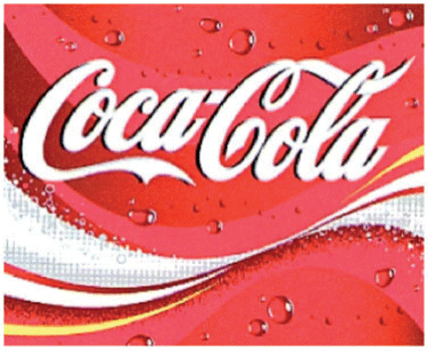
95. One aspect of the judgment in Sainsbury received attention from both sides in the present case. Counsel for the trade mark proprietor in Sainsbury said that ‘vast swathes’ of marks in the UK registry would become vulnerable to a declaration of invalidity if the mark in issue was found to be invalid. Copies of the registrations of a very large number trade marks were filed in evidence to make that point good. By agreement, some were considered de bene esse and two were discussed in the judgment. One took the form of the words Coca Cola in their familiar script against a stylised background. The description stated: ‘The applicant claims the colours red, silver, white and yellow as an element of the mark.’ This was the visual representation:
96. The other had the description ‘The applicant claims the colours red and blue as an element of the mark’ and this representation:

97. In neither case was there precision about the hue of any of the colours claimed, whether by pantone numbers or otherwise.
98. So far as I am aware, since the registration of these two marks no finding has been made about the validity of either and I am not in a position to make a ruling about them. However, in Sainsbury this observation was made:
‘[66] The point about these examples is that the precise hue is unlikely to play a significant role in making the mark capable of distinguishing. The hues could vary without affecting the mark’s capacity to distinguish.’
99. There, the equivalent of s.1(1)(b) was being addressed. I think that the observation made in that paragraph could equally be said of the Trade Mark in this case.
100. In relation to s.1(1)(a), in my view the reasonable reader of the registration of the Trade Mark would have understood that the mark is a figurative mark as shown in the visual representation. The written description does not tell the reader much more save that the embossed effect used for the BABEK writing is of particular significance. The lack of much further information need not matter, provided there is no inconsistency. The colours of the Trade Mark are as shown in the visual representation. It was not necessary for the competent authorities or the public to be informed of pantone numbers because precise hues are not important to making the Trade Mark to satisfy the Sieckmann criteria. Aside from that, the shading of one colour to another in the visual representation would unhelpfully require a long list of pantone numbers.
101. Looking at this in more detail, the absence of pantone numbers does not lead to the result that the Trade Mark has multiple forms. It has one single form, that shown in the visual representation, subject to minor variations in hue which would not lead the reasonable reader to think that there is a lack of clarity or precision. For the same reason there is no ambiguity. The Trade Mark as shown is clear, precise, self-contained, easily accessible, intelligible, durable and objective. The Sieckmann criteria are satisfied.
102. Iceland’s final point was that there are colours in the visual representation which are not strictly either gold or black. That is true, but to my eye the impression delivered by the visual representation is of a trade mark coloured gold with shading. The shading is in approximations of black.
103. In my judgment, arriving at the conclusion that the verbal representation in the registration of the Trade Mark is inconsistent with the written description would need an assumed degree of pedantry on the part of the competent authorities and the public which, if required in law, would make the trade mark system unworkable.
Conclusion
104. The Trade Mark when registered satisfied the requirements of s.1(1) of the 1994 Act and was not registered in breach of section 3. The Trade Mark is validly registered.